

|
📷 Browse Media
Active Self Protection AI Art & Images Aria in the Sky Celebrity Videos and Pictures Cool Videos Crazy Videos and Pictures Facebook Fails Fail Pictures Fail Videos Funny Animals Funny Audio Funny Commercials Funny Jokes Funny Memes Funny Pictures Funny Signs Funny Videos Games Great Videos in Time Infographics iPhone Wallpaper Maxim Magazine Babes Military Aircraft Music Optical Illusions Other/Misc President Donald Trump Scary Videos and Pictures Screen Team Show Sexy Sexy Commercials Sexy Videos Stupid Movies and Videos Stupid People Pictures Stupid Signs Tesla Throwback Twitter Fails
|
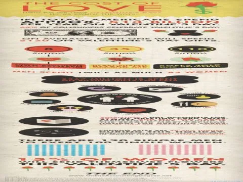
The internet has blessed us with infographics for absolutely everything, from the genuinely useful to the "why does this exist" category. We've reached peak information overload when someone takes the time to create elaborate visual guides for topics that range from intensely personal to perfectly mundane. Today we're examining two specimens that prove data visualization has officially jumped the shark, and we're all better for it. The Statistics Nobody Asked For But Everyone Secretly WantedLeave it to the internet to take something universally practiced but rarely discussed and transform it into a colorful chart with percentages and demographics. Solo activity statistical breakdown delivers exactly what you never knew you needed: a comprehensive breakdown complete with pie charts and bar graphs that would make your high school statistics teacher extremely uncomfortable. It's the kind of content that makes you wonder who funded this research and whether they're accepting grant applications. The commitment to thoroughness is admirable, even if the subject matter makes you want to clear your browser history just from reading it. America's Favorite Pastime Gets the Data TreatmentOn the complete opposite end of the spectrum, we have sports statistics rendered in glossy visual format. Super Bowl trivia visualized proves that Americans will consume football content in any possible format, including elaborate graphics that break down everything from halftime show budgets to chicken wing consumption rates. It's wholesome, it's patriotic, and it pairs perfectly with the previous entry in a way that really captures the duality of internet culture. One minute we're analyzing deeply private human behavior, the next we're learning how many gallons of beer get consumed during commercial breaks. Both are presented with equal gravitas and professional design work, because when infographics get too real, they commit fully to the bit. |
Welcome Guest!

















🎭
Join AYSOS Free
Save favorites, upload media, and join the community — it's quick and free.
Continue with Google Continue with Facebook Continue with Discord Continue with Xor








💬 Comments
No comments yet. Be the first!
Sign in to leave a comment.