

|
📷 Browse Media
Active Self Protection AI Art & Images Aria in the Sky Celebrity Videos and Pictures Cool Videos Crazy Videos and Pictures Facebook Fails Fail Pictures Fail Videos Funny Animals Funny Audio Funny Commercials Funny Jokes Funny Memes Funny Pictures Funny Signs Funny Videos Games Great Videos in Time Infographics iPhone Wallpaper Maxim Magazine Babes Military Aircraft Music Optical Illusions Other/Misc President Donald Trump Scary Videos and Pictures Screen Team Show Sexy Sexy Commercials Sexy Videos Stupid Movies and Videos Stupid People Pictures Stupid Signs Tesla Throwback Twitter Fails
|
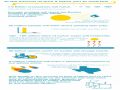
There's a special breed of infographic out there that doesn't just inform—it overshares. These aren't your typical pie charts about quarterly earnings or helpful diagrams about how to fold a fitted sheet. No, these are the information dumps that make you wonder if maybe some data should have stayed locked in a spreadsheet somewhere, never to see the light of day. Yet here we are, unable to look away. When Coffee and Burgers Get Too RealTake, for instance, the kind of deep dive that tells you exactly how many chicken nuggets America consumes per second or how many gallons of Frappuccino syrup get pumped into unsuspecting customers every hour. McDonald's and Starbucks fun facts delivers exactly this kind of information overload, complete with colorful graphics that burn these statistics into your brain forever. Now you'll never order a Big Mac without mentally calculating your contribution to the billions served. You're welcome for that existential crisis with your fries. Statistics Nobody Asked For But Everyone Clicks OnThen there are the infographics that venture into territory so personal, so specific, that you have to admire the audacity of whoever gathered the data. Someone actually took the time to compile state-by-state breakdowns, peak usage hours, and device preferences for activities people do in private. America's porn consumption statistics presents exactly this level of detail, turning what should be a simple bar graph into a documentary nobody needed. It's the visual equivalent of someone showing you their browser history unprompted at a dinner party. The internet has decided that if information exists, it must be visualized, color-coded, and shared widely. And honestly? We keep clicking. Because deep down, we all want to know just how weird the world really is, one overly detailed infographic at a time. |
Welcome Guest!














🎭
Join AYSOS Free
Save favorites, upload media, and join the community — it's quick and free.
Continue with Google Continue with Facebook Continue with Discord Continue with Xor








💬 Comments
No comments yet. Be the first!
Sign in to leave a comment.