

|
📷 Browse Media
Active Self Protection AI Art & Images Aria in the Sky Celebrity Videos and Pictures Cool Videos Crazy Videos and Pictures Facebook Fails Fail Pictures Fail Videos Funny Animals Funny Audio Funny Commercials Funny Jokes Funny Memes Funny Pictures Funny Signs Funny Videos Games Great Videos in Time Infographics iPhone Wallpaper Maxim Magazine Babes Military Aircraft Music Optical Illusions Other/Misc President Donald Trump Scary Videos and Pictures Screen Team Show Sexy Sexy Commercials Sexy Videos Stupid Movies and Videos Stupid People Pictures Stupid Signs Tesla Throwback Twitter Fails
|
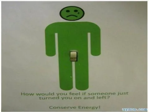
There's a special circle of hell reserved for designs that make you tilt your head, squint your eyes, and still have no idea what you're looking at. We're talking about those graphics that passed through multiple approval stages, survived countless meetings, and somehow emerged into the world looking like a fever dream. These are the design disasters that confuse everyone who encounters them, leaving us all wondering if the creators were pranking us or genuinely thought they nailed it. When Olympic Spirit Gets Lost in TranslationThe 2012 Summer Games should have been a triumph of British design and elegance. Instead, The London Olympics logo disaster became one of the most mocked pieces of branding in sporting history. People saw everything from inappropriate stick figures to broken glass to a confused pile of geometric shapes having an identity crisis. The committee spent hundreds of thousands on this masterpiece, which really makes you wonder what the rejected concepts looked like. Did anyone in that boardroom have the courage to raise their hand and ask what they were actually looking at? Or did everyone just nod politely while secretly planning their resignation letters? Going Green Has Never Been So UncomfortableEnvironmental messaging should inspire us to save the planet, not make us question every life choice that led to this moment. Earth Day's questionable green message proves that sometimes enthusiasm for Mother Earth can manifest in ways that are, shall we say, anatomically unfortunate. When your eco-friendly graphic makes people do a double-take for all the wrong reasons, you've officially missed the mark. The designer probably had the best intentions—celebrate nature, embrace organic shapes, spread environmental awareness. What they achieved instead was a masterclass in unintentional innuendo that no amount of recycling can fix. Maybe some concepts should stay in the compost bin where they belong. |
Welcome Guest!







🎭
Join AYSOS Free
Save favorites, upload media, and join the community — it's quick and free.
Continue with Google Continue with Facebook Continue with Discord Continue with Xor




💬 Comments
No comments yet. Be the first!
Sign in to leave a comment.